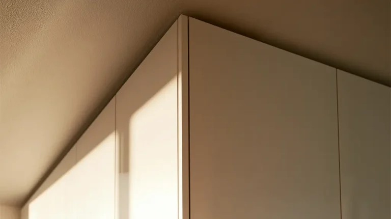


Most people choose a colour from a small sample. A door swatch, a paint card, a section of finish held up in a showroom. It looks right in that moment, so the decision gets made. Then the furniture arrives, the units go in, and the colour looks different. Sometimes only slightly. Sometimes enough to be a genuine disappointment.
This happens constantly, and it isn’t a mistake in the finish or the manufacturing. It’s how colour behaves. The same colour changes depending on the light it sits in, the surfaces around it, and the time of day it’s being looked at. Understanding that before you choose saves a lot of regret later.
Light Direction Changes Everything
The single biggest factor is which way the room faces. Light coming from different directions has a different quality, and that quality changes how a colour reads.
- North-facing rooms get cool, indirect light for most of the day. It’s steady and soft, but it has a blue undertone that makes colours look cooler and slightly flatter. Warm colours can lose some of their warmth. Greys can start to look cold or even slightly blue.
- South-facing rooms get the most direct light, and it’s warm. Colours look brighter and richer here. A finish that seemed safe in a north-facing showroom can look noticeably warmer once it’s installed in a south-facing room.
- East-facing rooms get warm light in the morning and cooler light later in the day. The colour effectively shifts as the day goes on.
- West-facing rooms are the opposite, cooler in the morning and warmer in the evening.
This is why a finish chosen in one setting can look wrong in another. The showroom and your home almost never face the same way, so the light doing the work is different in each place.
Natural Light and Artificial Light Don’t Agree
The problem doesn’t stop when the sun goes down. Artificial light has its own colour temperature, and it changes the finish again.
Warm white bulbs, the most common choice in homes, add a yellow tone. This can flatter warm finishes and make cool greys look slightly muddy. Cool white or daylight bulbs do the reverse. They sharpen cool tones and can make warm finishes look washed out.
A wardrobe or kitchen is looked at under both natural and artificial light every day. A finish needs to work in both. A colour that looks perfect in daylight but wrong under the evening lights is only half right, and the evening is often when the room gets used most.
Why the Showroom Is Misleading
Showrooms are lit deliberately. The lighting is chosen to present finishes at their best, usually bright and fairly neutral. That’s useful for seeing a finish clearly, but it isn’t the light the finish will actually live in.
A sample also behaves differently from a full surface. A small swatch surrounded by other colours reads differently to a full run of units covering an entire wall. Colour intensifies as the area increases. A grey that looks soft on a swatch can look darker and heavier across a large wardrobe. A colour that looks gentle on a card can feel much stronger once it’s the dominant surface in the room.
This is worth remembering with any finish decision. The sample is a guide, not a preview.
The Surfaces Around It Matter Too
A colour is never seen in isolation. It sits next to walls, floors, worktops, and other furniture, and those surfaces reflect their own tones onto it.
A wood floor with a warm tone will push warmth onto a nearby wardrobe. A cool grey floor does the opposite. A strong wall colour will cast a subtle version of itself onto anything beside it. This is why finishes should always be considered together rather than one at a time. A door finish, a worktop, and a floor might each look good alone and still clash once they’re in the same room.
How to Choose With Confidence
None of this means colour choice is guesswork. It means the sample needs to be tested in the right conditions before the decision is final.
- Take the sample home. Look at it in the actual room, against the actual walls and floor, not just in the showroom.
- Look at it at different times of day. Morning, afternoon, and evening under the lights. A finish that holds up across all three is a safe choice.
- Hold it near the other finishes. Check the door colour against the worktop and the flooring together, not separately.
- View it at scale where you can. A larger sample tells you far more than a small swatch, because colour changes as the area grows.
A few days of checking a sample properly is worth far more than the disappointment of a finished room that doesn’t look the way it was meant to.
Colour is one of the first things people notice in a room and one of the easiest to get wrong. Getting it right is mostly about testing it honestly in the space it’s going to live in, under the light it’s actually going to sit in.
If you’re ready to transform your space, let’s get started.